Electricity Map
During all the political discussions for the need of clean power, I always wondered about real data for this domain, i.e. how much of our electrical power is coming from what sources. As it wasn't that important, I never even tried to find any source for this and continued to live in ignorance. By sheer accident the situation changed recently as I learned about the Electricity Map web site answering exactly this question in real time. The site focuses on the release of the green house gas CO2 to visualize the data.
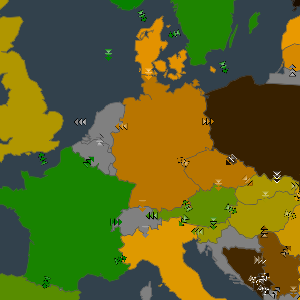
It is very instructive to study the individual countries, their power mix and the trade of electricity across the borders. A few questions that popped into my mind when visiting it for the first time were pretty easy to answer:
Why does Norway have such an excellent CO2 balance?
Why is France also doing very good? Ok, so the problems of nuclear power plants are beyond the data of this page.
What is the installed capacity of solar and wind energy in Germany compared to nuclear power plants?
As you are still reading, I may as well disclose how I learned about the existence of that web site. At the end of the talk A hacker's guide to Climate Change - What do we know and how do we know it? given at the recent 34C3:TUWAT congress the site gets mentioned in the Q&A section.
The congress took place in Leipzig at the end of December 2017 and has a lot of very diverse, yet interesting presentations. It will take me some more calendar time to watch the ones that caught my attention. Judging by the view counts of the presentations, I'm absolutely positive that my interests are somewhat peculiar.
Comments
Comments powered by Disqus